Blayden - Personal Portfolio & Resume HTML Template Documentation
by:
mix_design
version: 1.0.0
created: 14.05.2024
last update: 14.05.2024
01
Thank you for choosing Blayden - personal portfolio and resume HTML template. We have prepared detailed documentation to make Blayden customization an easy task for you. If you have any questions that are beyond the scope of this help file, you can email us on support@mixdesign.club.
We would be very happy if you could rate this item here with 5 stars. Your feedback is very important so write us a line 😀!
02
Follow the steps below to setup your site template:
In order to start working with Blayden unzip the downloaded package and open HTML folder to find all ready-to-use template files. Choose one of the demo *.html files (any ready-to-use demo you like) and rename it to index.html.
Next you'll need to prepare a project for customization. Below is a list of files and folders that are required in the root directory of your project:
index.html - your chosen *.html file (renamed already);css folder - stylesheet files;js folder - JavaScript files;fonts folder - icon fonts files;img folder for project images and favicon;mail.php file for sending e-mails;.htaccess - this file contain rules for files caching on web server;The other files can be used according to your preferences.
Your project is ready to go! Now you can start adding your texts, images and video to your new awesome website.
After the customization is over, you'll need to upload the project files to your hosting web server using FTP client or cPanel interface in order to use it on your website.
03
After downloading and extracting template package you will find 3 folders:
This section describes
HTML
folder structure. More about
BlaydenGULP
folder structure you can find out in
BlaydenGULP
section.
Blayden is one page HTML template. So, mostly you will need one
*.html
file and supporting
*.css,
*.js,
*.php
files with some images. All the directories and files are well organized as it shown on the image bellow.
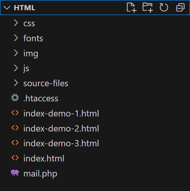
source-files folder contains all expanded CSS files, expanded JavaScript files, plugins and components files;mail.php file for sending e-mails is located in the root directory;.htaccess file is located in the root directory. This file contain rules for files caching on web server.Blayden is one page HTML template and comes with dark and light color themes and 3 ready-to-use demo pages with various elements:
Blayden has a simple and easy to customize structure based on Bootstrap 5.3.2 Grid. Here is a sample page structure:
      <!DOCTYPE html>
      <html lang="en" dir="ltr">

        <head>
          Meta tags, Title, Favicon and Icons, Facebook Metadata, CSS, Custom Browser Color
        </head>

        <body>

          <!-- Loader Start -->
          <div id="loader" class="loader">
            ...
          </div>
          <!-- Loader End -->

          <!-- Header Start -->
          <header id="header" class="header d-flex justify-content-center loading__fade">
            ...
          </header>
          <!-- Header End -->

          <!-- Fixed Logo Start -->
          <div class="logo loading__fade">
            ...
          </div>
          <!-- Fixed Logo End -->

          <!-- Fixed Color Switch Start -->
          <div class="color loading__fade">
            ...
          </div>
          <!-- Fixed Color Switch End -->

          <!-- Page Content Start -->
          <main id="page-content" class="page-content">

            <!-- Main Section Start -->
            <section id="home" class="main home">
              ...
            </section>
            <!-- Main Section End -->

            <!-- Inner Section - Portfolio - Start -->
            <section id="portfolio" class="inner inner-grid-bottom portfolio">
              ...
            </section>
            <!-- Inner Section - Portfolio - End -->

            <!-- Inner Section - About - Start -->
            <section id="about" class="inner inner-grid-bottom about">
              ...
            </section>
            <!-- Inner Section - About - End -->

            <!-- Inner Section - Services - Start -->
            <section id="services" class="inner inner-stack-bottom services">
              ...
            </section>
            <!-- Inner Section - Services - End -->

            <!-- Inner Section - Resume - Start -->
            <section id="resume" class="inner inner-grid-bottom resume">
              ...
            </section>
            <!-- Inner Section - Resume - End -->

            <!-- Inner Section - Contact - Start -->
            <section id="contact" class="inner contact inner-grid-bottom no-padding-bottom">
              ...
            </section>
            <!-- Inner Section - Contact - End -->

          </main>
          <!-- Page Content End -->

          <!-- Bottom Background Images Start -->
          <div class="bottom__background bottom-bg-01">
            ...
          </div>
          <!-- Bottom Background Images End -->

          <!-- Mobile Menu Bottom Placeholder Start -->
          <div class="header-offset"></div>
          <!-- Mobile Menu Bottom Placeholder End -->

          <!-- To Top Button Start -->
          <a href="#0" id="to-top" class="btn btn-to-top slide-up">
            <i class="ph ph-arrow-up"></i>
          </a>
          <!-- To Top Button End -->

          <!-- Root element of PhotoSwipe. Must have class pswp. -->
          <div class="pswp" tabindex="-1" role="dialog" aria-hidden="true">
            ...
          </div>

          <!-- Load Scripts Start -->
          <script src="js/libs.min.js"></script>
          <script src="js/gallery-init.js"></script>
          <script src="js/app.js"></script>
          <!-- Load Scripts End -->

        </body>

      </html>
Blayden template CSS files have a well-organized structure and a table of contents, as you can see on image below:
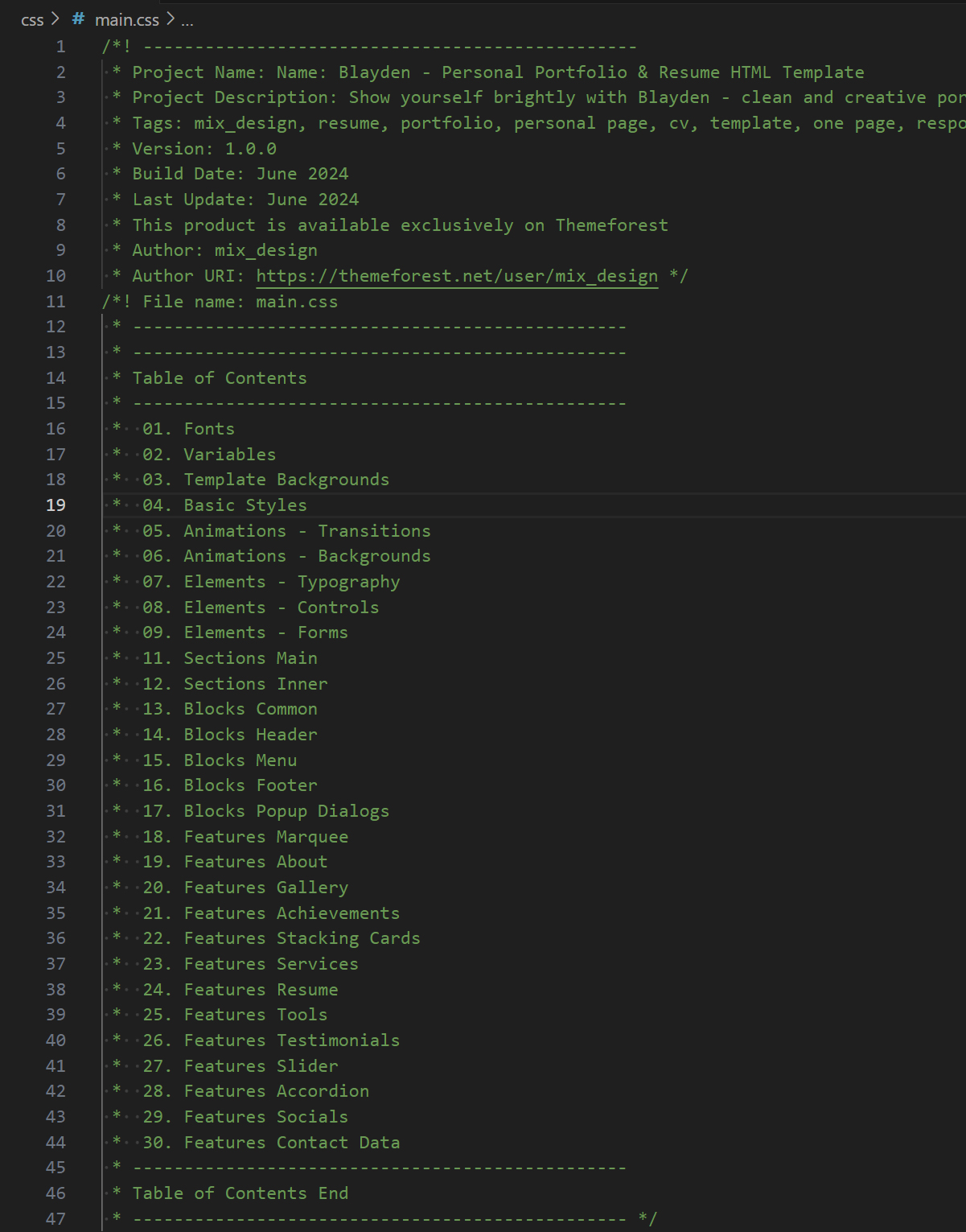
All CSS files are placed in
css
folder and have to be included in the
<head>
tag.
Blayden uses uncompressed CSS files.
If you want to improve Google PageSpeed Insights performance, you can use minificated files from
source-files → blayden-css-min-files.
      <!-- Template Styles Start-->
      <link rel="stylesheet" type="text/css" href="css/loaders/loader.css">
      <link rel="stylesheet" type="text/css" href="css/plugins.css">
      <link rel="stylesheet" type="text/css" href="css/main.css">
      <!-- Template Styles End-->
CSS files that have to be included in chosen .html file:
loader.css
plugins.css
main.css
If you want to customize CSS styles, We recommend to create your own
custom.css
file and include it to
Template Styles
section of the
HTML
file. This solution will help you in future updates.
All JavaScript files are placed in
js
folder and have to be included before the
</body>
tag.
libs.min.js - all JavaScript libraries that are necessary for Blayden proper work, are compiled in this file;gallery-init.js - for photoswipe gallery initialization;app.js - includes other scripts calls and settings;
      <!-- Load Scripts Start-->
      <script src="js/libs.min.js"></script>
      <script src="js/gallery-init.js"></script>
      <script src="js/app.js"></script>
      <!-- Load Scripts End-->
We used minificated
libs.min.js
file to add all necessary JavaScript libraries to this template. The file contains:
All this uncompressed files you can find in the source-files folder.
04
In the Blayden template we used Urbanist Font, Fontawesome Iconic Font and Phosphor Iconic Font.
Blayden uses
The font is embedded in the main.css file:
@import url('https://fonts.googleapis.com/css2?family=Urbanist:ital,wght@0,100..900;1,100..900&display=swap');You can customize this font or embed another fonts for your project with Google Fonts. In this case, you'll also need to change the fonts in the css files per your fonts used.
Blayden uses Phosphor iconic font. You can use phosphoricons.com page to easily find the icon you want to use. All icons are already compiled in the plugins.css file and ready for use.
To insert icon in your project, just choose Web tab and copy the code: <i class="ph ph-heart"></i>, <i class="ph ph-arrow-up"></i>, <i class="ph ph-instagram-logo"></i>.
<li>
    <a href="https://www.instagram.com/" target="_blank">
        <i class="ph ph-instagram-logo"></i>
    </a>
</li>
More information about Phosphor icons you can find on official documentation website - Phosphor Docs.
Blayden uses free version of FontAwesome 6.5.1 iconic font. You can use fontawesome.com/icons page to easily find the icon you want to use. Solid, regular and brands icons are already compiled in the plugins.css file and ready for use.
To change icons, just change the class names: fa-solid fa-heart, fa-brands fa-instagram, fa-regular fa-address-book.
<li>
    <a href="https://www.facebook.com/" target="_blank">
        <i class="fa-brands fa-facebook"></i>
    </a>
</li>
More information about FontAwesome you can find on official documentation website - FontAwesome Docs.
05
Blayden covers almost all platforms design requirements for favicon and icons:
Classic favicon:
<link rel="icon" href="img/favicon/favicon.ico" sizes="any">
Android Web App Manifest & Apple Touch Icon:
        <link rel="apple-touch-icon" href="img/favicon/apple-touch-icon.png">
        <link rel="manifest" href="img/favicon/manifest.webmanifest">
Universal SVG Icon for All Sizes ang Dark & Light Browser Color Themes:
<link rel="icon" href="img/favicon/icon.svg" type="image/svg+xml">
Facebook Metadata:
        <!-- Facebook Metadata Start -->
        <meta property="og:image:height" content="1200">
        <meta property="og:image:width" content="1200">
        <meta property="og:title" content="Blayden - Personal Portfolio & Resume HTML Template">
        <meta property="og:description" content="Show yourself brightly with Blayden - clean and creative portfolio and resume template!">
        <meta property="og:url" content="https://mixdesign.club/themeforest/blayden">
        <meta property="og:image" content="https://mixdesign.club/themeforest/blayden/img/og-image.jpg">
        <!-- Facebook Metadata End -->
You can use Blayden favicon as an example or generate new one with Favicon Generator or any other favicon generator by your needs.
06
Blayden template comes with easy-to-customize page elements. You can choose from 3 ready-to-use demo files, 2 color themes, various page elements and blocks and much more.
Loader will hide contents of your site until it's fully loaded. If you want to customize or remove loader, find this code in *.html file:
<!-- Loader Start -->
<div id="loader" class="loader">
  <div class="loader__wrapper">
    <div class="loader__content">
      <div class="loader__count">
        <span class="count__text">0</span>
        <span class="count__percent">%</span>
      </div>
    </div>
  </div>
</div>
<!-- Loader End -->
Loader styles are included in the <head> tag:
<!-- Template Styles Start-->
<link rel="stylesheet" type="text/css" href="css/loaders/loader.css">
...
<!-- Template Styles End-->Blayden template provides 2 color themes and 3 ready-to-use demo pages. The template automatically detects the device's color theme and applies the same one - dark or light. You can change the color theme by clicking color theme switcher.
It's easy to change the dark and light color themes by changing default variables in the main.css file:
:root {
  ...
  /* light color scheme */
  --base--light: #BABEC8;
  ...
  /* dark color scheme */
  --base--dark: #141414;
  ...
  /* permanent colors */
  --per-base: #141414;
  ...
}
Feel free to experiment!
The logo container is fixed in the top left corner of the page and contains image ant text part:
<!-- Fixed Logo Start -->
<div class="logo loading__fade">
  <a href="#home" class="logo__link">
    <!-- logo icon -->
    <svg xmlns="http://www.w3.org/2000/svg" x="0px" y="0px" viewBox="0 0 50 50" style="enable-background:new 0 0 50 50;" xml:space="preserve">
      ...
    </svg>
    <!-- logo text -->
    <span class="logo-text">Blayden*</span>
  </a>
</div>
<!-- Fixed Logo End -->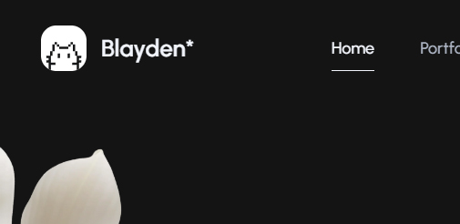
Please note! If you want to change the logo color with the color theme switch button,
you need to use an SVG inline code image with fill="currentColor" property or use CSS variables in the CSS part of inline SVG image:
  <svg xmlns="http://www.w3.org/2000/svg" width="50px" height="50px" viewBox="0 0 50 50" fill="currentColor">
    <path id="caption" fill="currentColor" d="..."/>
    <path id="logo" fill="currentColor" d="..."/>
  </svg>
<svg xmlns="http://www.w3.org/2000/svg" x="0px" y="0px" viewBox="0 0 50 50" style="enable-background:new 0 0 50 50;" xml:space="preserve">
...
<style type="text/css">
.mxd-background {
fill: var(--neutral-bright);
}
.mxd-cat {
clip-path: url(#mxd-path-id);
fill: var(--t-opp-bright);
}
</style>
...
</svg>Of course, you can use an ordinary <img> tag, but in this case the logo won't change it's color with the theme.
All images used in the Blayden template live demo are just for preview purpose only and they are not included in main download files. You easily can find all images on freepik.com or pexels.com. We are using placeholders from dummyimage.com instead of real images. You can easily replace placeholder URL with a path to your image like img/yourimage.jpg.
All tmplate background images you can replace in the main.css file:
/* ------------------------------------------------*/
/* Template Backgrounds Start */
/* ------------------------------------------------*/
.main-image-1 {
  background-image: url("https://dummyimage.com/1400x1000/414141/636363");
}
...
/* ------------------------------------------------*/
/* Template Backgrounds End */
/* ------------------------------------------------*/Blayden template comes with 1 header type with left aligned menu links and right aligned controls.
Desktop view:

Mobile view:
Header contains template's navigation list. You can find the header in the beginning of the *.html file:
<!-- Header Start -->
<header id="header" class="header d-flex justify-content-center loading__fade">
  <!-- Navigation Menu Start -->
  <div class="header__navigation d-flex justify-content-start">
    <nav id="menu" class="menu">
      <ul class="menu__list d-flex justify-content-start">
        ...
        <li class="menu__item">
          <a class="menu__link btn" href="#portfolio">
            <span class="menu__caption">Portfolio</span>
            <i class="ph ph-squares-four"></i>
          </a>
        </li>
        ...
      </ul>
    </nav>
  </div>
  <!-- Navigation Menu End -->
</header>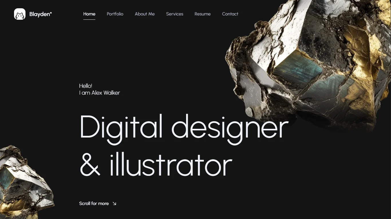
<!-- Header End -->Blayden template comes with 3 creative layouts with various headlines and parallax images. You can choose between different images speed and positions and 3 headline types. Parallax images settings you can find in the Animated Backgrounds sections of this file.
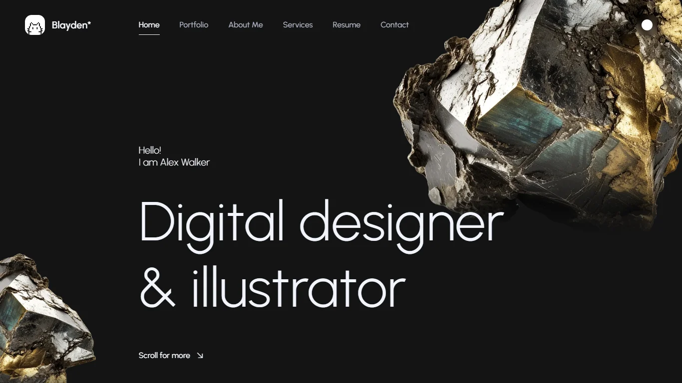
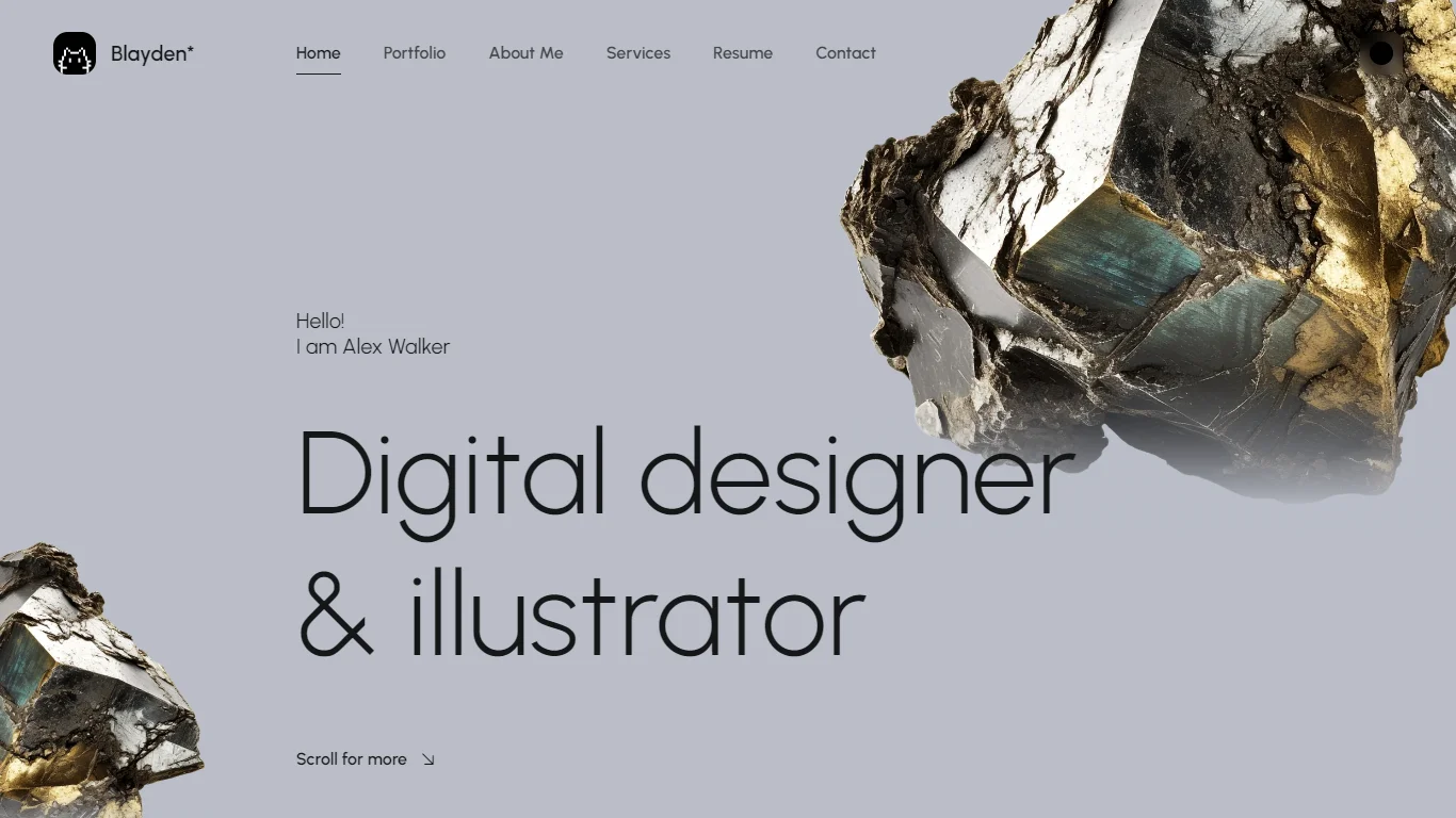
1. Large left aligned headline with parallax images. Beautifully designed layout with large headline, and parallax images. Parallax images settings you can find in the Animated Backgrounds sections of this file.
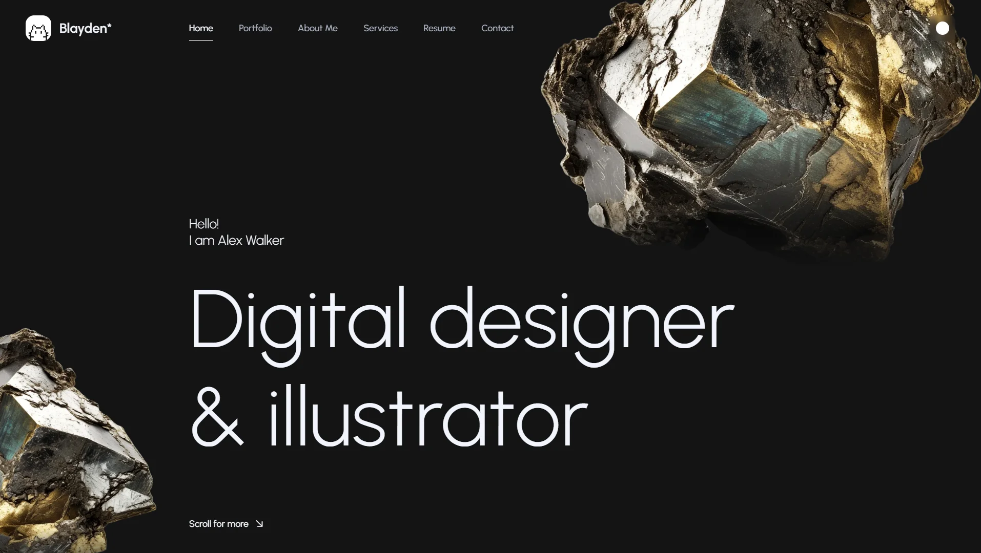
Replace this headline demo text with your own:
<!-- Headline Start -->
<div id="headline" class="headline d-flex align-items-start flex-column loading-wrap">
  <p class="headline__subtitle space-bottom loading__item">Hello!<br>I am Alex Walker</p>
  <h1 class="headline__title loading__item">Digital designer<br>& illustrator</h1>
  <div class="headline__btn loading__item">
    <a class="btn btn-line-small icon-right slide-right-down" href="#portfolio">
      <span class="btn-caption">Scroll for more</span>
      <i class="ph ph-arrow-down-right"></i>
    </a>
  </div>
</div>
<!-- Headline End -->
2. Fullscreen centered headline with assimetric parallax images. Parallax images settings you can find in the Animated Backgrounds sections of this file.
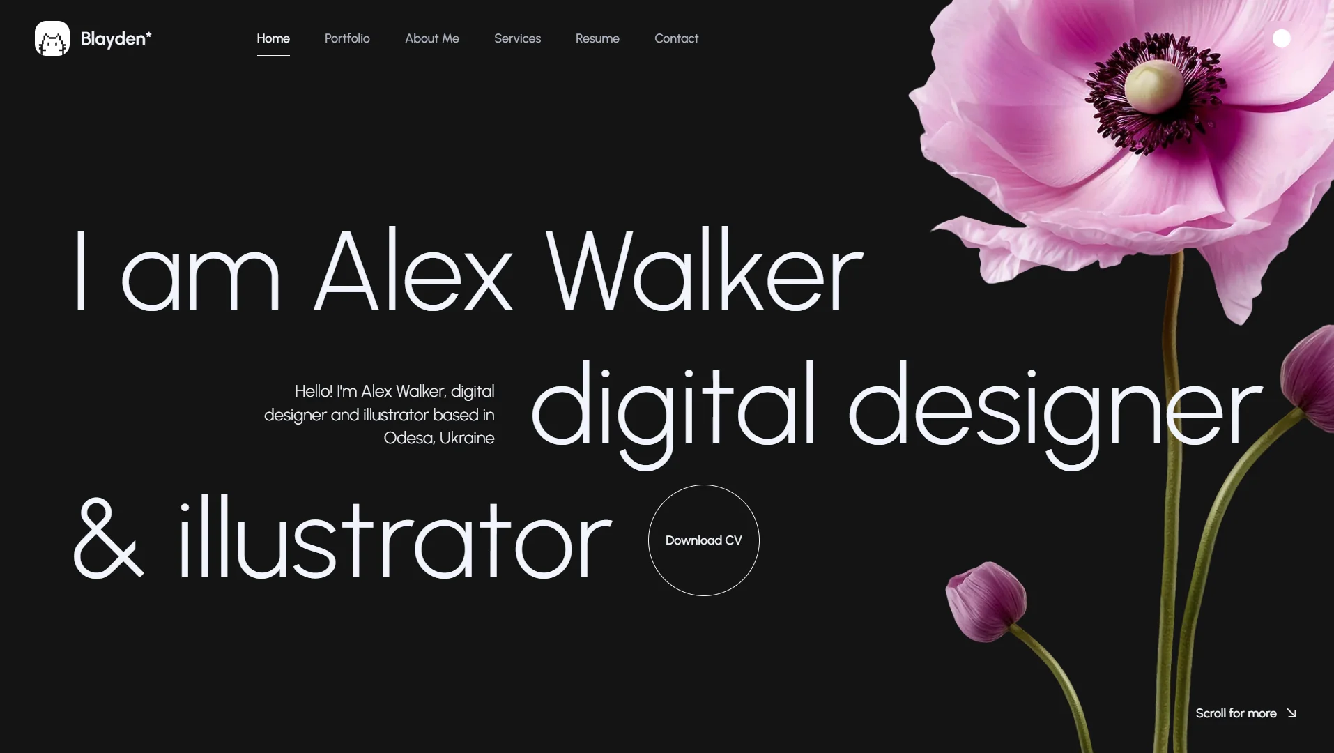
Replace this headline demo text with your own:
<!-- Headline Start -->
<div id="headline" class="headline headline-centered d-flex align-items-start flex-column loading-wrap">
<h1 class="headline__title fullwidth d-md-flex flex-md-column">
<span class="title__line d-md-flex align-items-md-center justify-content-md-start loading__item">I am Alex Walker</span>
<span class="title__line d-md-flex justify-content-md-end loading__item">
<em class="text-end">Hello! I'm Alex Walker, digital designer and illustrator based in Odesa, Ukraine</em>
<span>digital designer</span>
</span>
<span class="title__line d-md-flex align-items-center justify-content-xl-start loading__item">
<span>& illustrator</span>
<a class="btn btn-circle-text hover-circle" href="#0">
<em></em>
<span class="btn-caption">Download CV</span>
</a>
</span>
</h1>
<div class="headline__datamobile loading__fade">
<p>Hello! I'm Alex Walker, digital designer and illustrator based in Odesa, Ukraine</p>
<a class="btn btn-circle-text hover-circle" href="#0">
<em></em>
<span class="btn-caption">Download CV</span>
</a>
</div>
</div>
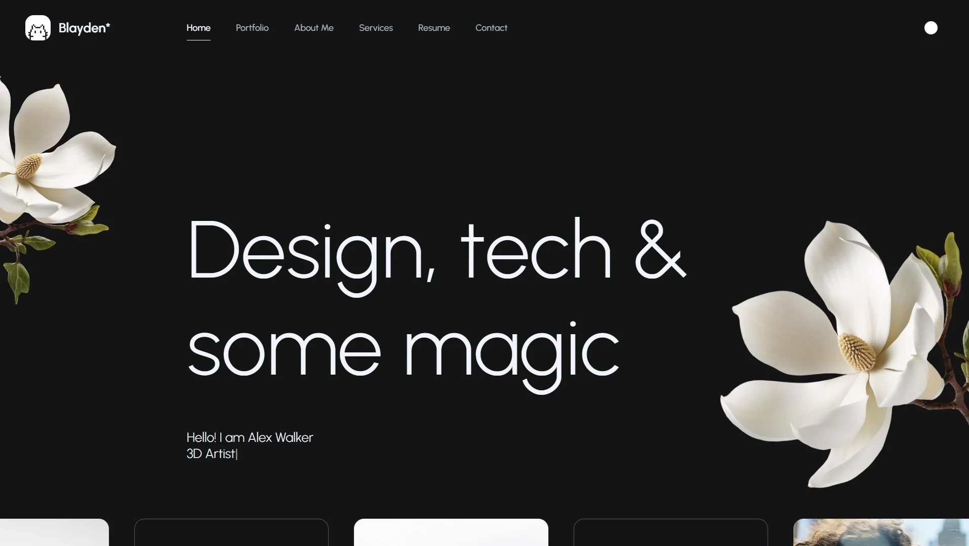
<!-- Headline End -->3. Large left aligned headline with animated type and parallax images. Parallax images settings you can find in the Animated Backgrounds sections of this file. Animated type settings you can find in the Plugins sections of this file.

Replace this headline demo text with your own:
<!-- Headline Start -->
<div id="headline" class="headline headline-95-desktop d-flex align-items-start flex-column loading-wrap">
  <h1 class="headline__title loading__item">Design, tech & some magic</h1>
  <p class="headline__subtitle space-top animated-type loading__item">Hello! I am Alex Walker
    <br>
    <span id="typed-strings">
      <b>UI/UX designer</b>
      <b>3D Artist</b>
      <b>Illustrator</b>
    </span>
    <span id="typed"></span>
  </p>
</div>
<!-- Headline End -->
07
We used Typed.js plugin for animated headline feature. To customize an animated headline,
you need to find the following markup in the main section of the *.html file and change the content of <b> tags:
<p class="headline__subtitle space-top animated-type loading__item">Hello! I am Alex Walker
  <br>
  <span id="typed-strings">
    <b>UI/UX designer</b>
    <b>3D Artist</b>
    <b>Illustrator</b>
  </span>
  <span id="typed"></span>
</p>
You can find headline settings (like type speed) in the appjs file:
// --------------------------------------------- //
// Typed.js Plugin Settings Start
// --------------------------------------------- //
var animatedHeadline = $(".animated-type");
if(animatedHeadline.length){
  var typed = new Typed('#typed', {
    stringsElement: '#typed-strings',
    loop: true,
    typeSpeed: 60,
    backSpeed: 30,
    backDelay: 2500
  });
}
// --------------------------------------------- //
// Typed.js Plugin Settings End
// --------------------------------------------- //
Visit Typed.js plugin website for more details and settings - mattboldt.com/demos/typed-js
Blayden uses Swiper Slider Plugin for the testimonials slider. It's a simple slider with navigation buttons, pagination and slide effect:
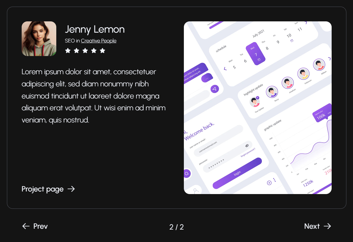
      <!-- Testimonials Slider Start -->
      <div class="testimonials-slider">
        <!-- slider main container -->
        <div class="swiper-testimonials">
          <!-- additional required wrapper -->
          <div class="swiper-wrapper">
            <!-- slides -->
            <div class="swiper-slide">
              ...
            </div>
            <div class="swiper-slide">
              ...
            </div>
          </div>
          <!-- navigation buttons -->
          <div class="swiper-button-prev mxd-slider-btn mxd-slider-btn-square-prev animate-in-up">
            ...
          </div>
          <div class="swiper-button-next mxd-slider-btn mxd-slider-btn-square-next animate-in-up">
            ...
          </div>
        </div>
      </div>
      <!-- Testimonials Slider End -->
Find the Load Scripts section at the end of <body> and make sure that all the necessary js files are added in the following order:
      <!-- Load Scripts Start -->
      <script src="js/libs.min.js"></script>
      ...
      <script src="js/app.js"></script>
      <!-- Load Scripts End -->
If you want to change this slider settings, find the
app.js
file in
js
folder and make the necessary changes to the swiper init lines:
      const swiper = new Swiper('.swiper-testimonials', {
        slidesPerView: 1,
        spaceBetween: 20,
        autoplay: true,
        speed: 1000,
        loop: true,
        loopFillGroupWithBlank: true,
        pagination: {
          el: ".swiper-pagination",
          type: "fraction",
        },
        navigation: {
          nextEl: '.swiper-button-next',
          prevEl: '.swiper-button-prev',
        },
      });
More information about Swiper settings you can find in the official documentation - swiperjs.com/get-started
Blayden uses Magnific Popup for portfolio projects presentation in the Demo #2 and Demo #3.
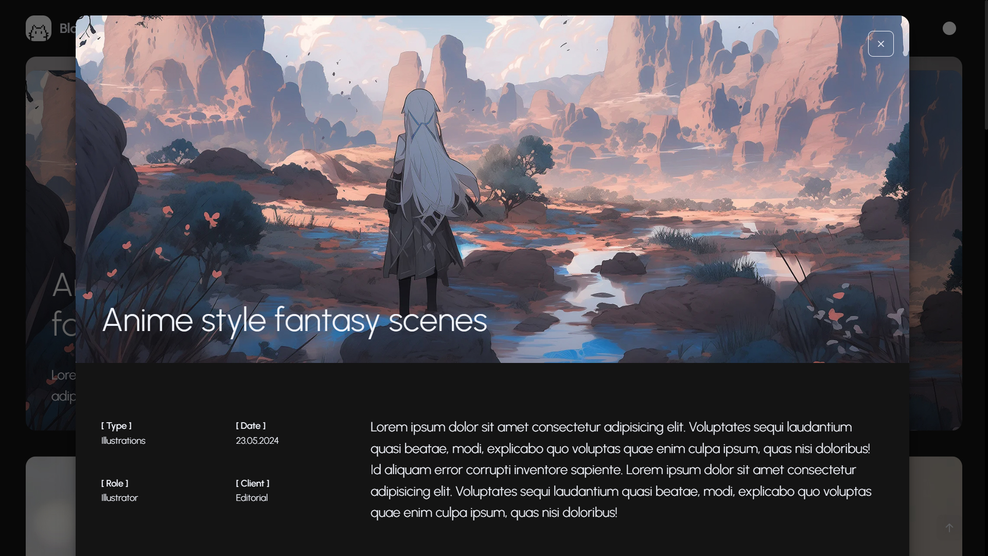
Each portfolio stacking card contains a corresponding popup trigger made with data-mfp-src property and a popup-trigger class.
<!-- Content Block - Portfolio Gallery Stack Grid Start -->
<div class="content__block">
  <div class="stack-wrapper">
      <div class="stack-offset solid-block"></div>
      <div class="portfolio-stack">
        ...
        <!-- portfolio stack single item -->
        <div class="stack-item">
          <div data-mfp-src="#portfolio-popup-2" class="portfolio-stack__inner portfolio-item-6 popup-trigger">
            <div class="portfolio-stack__descr">
              <h5 class="portfolio-stack__title light">Reflection AI project</h5>
            </div>
          </div>
        </div>
        ...
      </div>
    </div>
</div>
<!-- Content Block - Portfolio Gallery Stack Grid End -->
Also you need to locate the popup content in your *.html file. This popup must have a proper ID and an mfp-hide class to be invisible until it'll be triggered:
<!-- Portfilio Single Item Popup №2 Start -->
<div id="portfolio-popup-2" class="popup mfp-hide" data-lenis-prevent="">

  <!-- Popup Close Button Start -->
  <button class="mfp-close permanent-light"></button>
  <!-- Popup Close Button End -->

  <!-- Popup Content Start -->
  <div class="popup__container">
    ...
  </div>
  <!-- Popup Content End -->

</div>
<!-- Portfilio Single Item Popup №2 End -->
All popup parameters you can change in the app.js file:
// --------------------------------------------- //
// Magnific Popup Start
// --------------------------------------------- //
$(".popup-trigger").magnificPopup({
  type: "inline",
  fixedContentPos: true,
  fixedBgPos: true,
  overflowY: "scroll",
  preloader: false,
  midClick: true,
  removalDelay: 600,
  mainClass: "mfp-fade",
});
// --------------------------------------------- //
// Magnific Popup End
// --------------------------------------------- //
See dimsemenov.com/plugins/magnific-popup page for more settings.
Portfolio gallery is made using PhotoSwipe JavaScript Gallery.
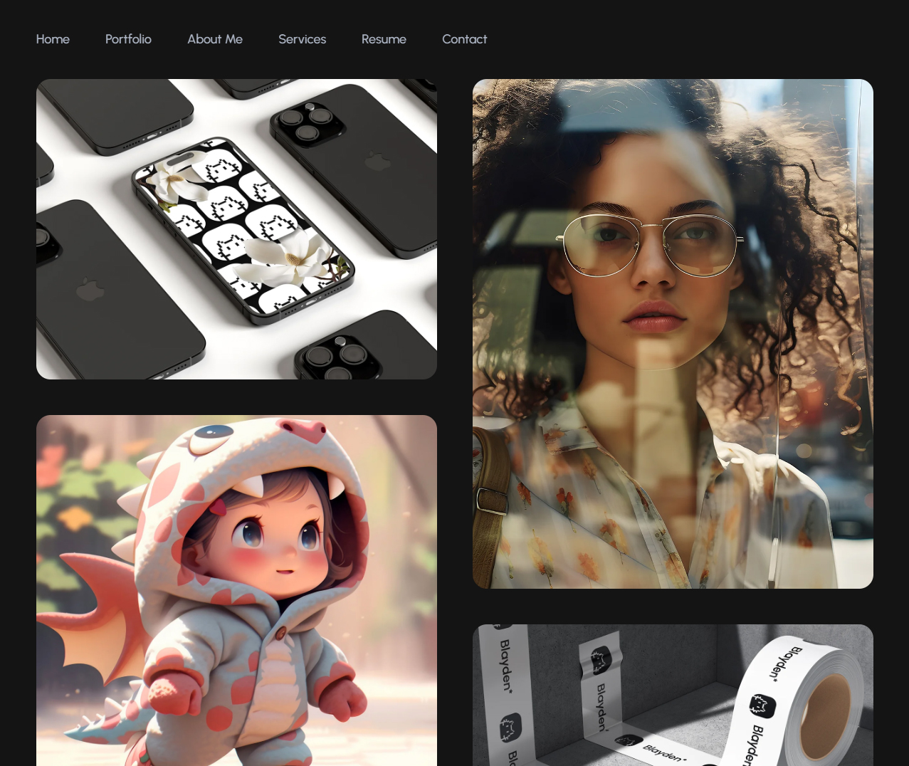
This is an example for one portfolio item, just duplicate it to add new pictures or fill it with your content:
<!-- portfolio gallery single item -->
<figure class="col-12 col-md-6 gallery__item grid-item animate-card-2" itemprop="associatedMedia" itemscope itemtype="http://schema.org/ImageObject">
  <a href="https://dummyimage.com/1400x1050/686868/737373" data-image="https://dummyimage.com/1400x1050/686868/737373" class="gallery__link" itemprop="contentUrl" data-size="1400x1050">
    <img src="https://dummyimage.com/1400x1050/686868/737373" class="gallery__image" itemprop="thumbnail" alt="Image description">
  </a>
  <figcaption class="gallery__descr" itemprop="caption description">
    <h5>Designer Portfolio
      <small>UI/UX design</small>
    </h5>
    <p class="small">Mauris porttitor lobortis ligula, quis molestie lorem scelerisque eu. Morbi aliquam enim odio,
      a mollis ipsum tristique eu.
    </p>
  </figcaption>
</figure>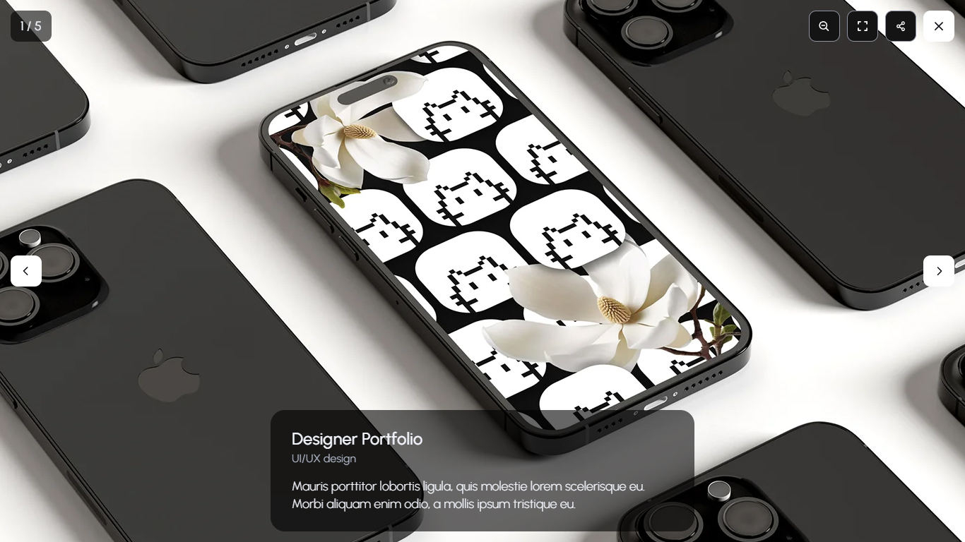
JavaScript files that have to be included:
<!-- Load Scripts Start-->
<script src="js/libs.min.js"></script>
<script src="js/gallery-init.js"></script>
...
<!-- Load Scripts End-->
More information about PhotoSwipe Gallery you can find in PhotoSwipe Documentation.
08
All backgrounds CSS styles are compiled in plugins.css file so you don't need to add any CSS files.
This background effect is created using a *.webp images with transparent background:
<!-- Intro Background Start -->
<div class="intro__background intro-bg-01">
  <div class="intro-bg-01__01" data-speed="0.6">
    <img src="https://dummyimage.com/1200x1200/4d4d4d/636363" alt="Background Objects">
    <div class="intro-bg__shadow"></div>
  </div>
  <div class="intro-bg-01__02" data-speed="0.8">
    <img src="https://dummyimage.com/1200x1200/4d4d4d/636363" alt="Background Objects">
    <div class="intro-bg__shadow"></div>
  </div>
</div>
<!-- Intro Background End -->
Replace the placeholder with your image directly in the *.html file. You can use *.webp or *.png images.
Parallax scroll animation is provided by GSAP and scrollTrigger. If you want to change the scroll speed for any object, just add data-speed property:
<div class="intro-bg-01__01" data-speed="0.6">gsap.to("[data-speed]", {
y: (i, el) => (1 - parseFloat(el.getAttribute("data-speed"))) * ScrollTrigger.maxScroll(window) ,
ease: "none",
scrollTrigger: {
start: 0,
end: "max",
invalidateOnRefresh: true,
scrub: 0
}
});09
Blayden template is provided with 1 working form type:
Blayden template has integrated ajax contact form.
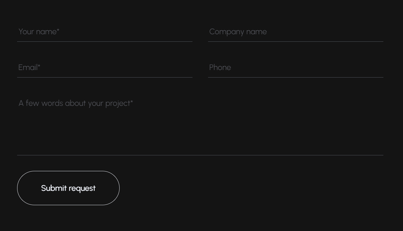
It's very easy to set up this forms to receive feedback on your e-mail:
mail.php file is added to the root directory of your project.<form> tag with id="contact-form" in the *.html file. <!-- Contact Form Start -->
<form class="form contact-form" id="contact-form">
<!-- Hidden Required Fields -->
<input type="hidden" name="project_name" value="Blayden Template">
<input type="hidden" name="admin_email" value="support@mixdesign.club">
<input type="hidden" name="form_subject" value="Contact Form Message">
<!-- END Hidden Required Fields-->
...
</form>
<!-- Contact Form End -->JavaScript files that have to be included:
<!-- Load Scripts Start-->
<script src="js/libs.min.js"></script>
...
<script src="js/app.js"></script>
<!-- Load Scripts End-->
Done! Now you can receive messages on your e-mail.
10
If you want to totally customize Blayden, you can use our all-inclusive BlaydenGULP template. BlaydenGULP includes Bootstrap 5 Grid, Gulp, Sass, Bourbon, Autoprefixer, Browsersync, Clean-CSS, CSS Beautify, Uglify, and other packages for efficient and comfortable work.
BlaydenGULP requires node, npm and git.
Install Node Modules: npm i
Run BlaydenGULP: gulp
app directory;sass directory;dist folder is a production folder. It contains ready project with optimized HTML, CSS, JS and images.gulp: run default gulp task for web development;
build: build project to dist folder;
clearcache: clear all gulp cache.
If you have any questions about BlaydenGULP, you can email us on support@mixdesign.club.
11
12